Trimble Business Center

 View Only

 TBC Font weight when printing sheets PDF

Scott Lehr's profile image
Scott Lehr posted 01-09-2023 11:40

Hello, 

I have noticed for some time now that when I plot to PDF the true type fonts coming out look "Blocky" or "Chunky" when the plan is zoomed out.  The same text coming out of autocad does not seem to have the same problem.   Does anyone else have this problem, or have any suggested solutions.  This may be my only gripe with drafting right in TBC. 
The example below shows Arial font when zoomed to actual size compared to when zoomed out on the same PDF. 

Actual Size Screen Shot of PDF:

When Zoomed out.
Ronny Schneider's profile image
Ronny Schneider
Which version are you using?
But this is an old drama and I believe still not fixed in 5.81 which I'm still not using in production.

I'm using the simplest stroke fonts exclusively. Also necessary to minimize PDF size since TBC is still plotting Text as polylines (multiple lines with truetype fonts), bloating up the PDF beyond belief. And even with that my bearing pad reports with thousands of texts get bloated up to 200 MB.

That's why we beg since years to have text plotted as text, also making the PDF searchable.
WYSIWYG from plan view to sheet view to PDF, especially with text, background to foreground order and text on top of linework is still not working properly.

Haven't run a comprehensive test on 5.81 yet. Might do this tonight on my private machine.
Charlie Sorg's profile image
Charlie Sorg
If this is still present in 5.81, I am not aware of it. From all of our internal testing and testing from some of the users experiencing the plot issue from 5.7x, we could not see the issue any longer. Can you confirm which version of TBC you're using, Mr. Lehr?
Scott Lehr's profile image
Scott Lehr
Yes I am using the latest 5.81.   I know there was a known issues with 5.80 where true type fonts were getting squished together on printing to PDF. But this is a different problem altogether.  And still present for me in 5.81.
Simple stoke fonts don't appear to have the same problem, but my company standard for drafting in AutoCad is Arial and other True Type fonts.  So I am hoping to get this working with all fonts. 

Thanks. 
SL
Ronny Schneider's profile image
Ronny Schneider
So, I did some experiments with various versions (5.32.1, 5.40.1, 5.52, 5.60.2, 5.70.1 and 5.81)
And what I can see is that the beefiness started with 5.4, all the way through to 5.70.1, but from my perspective it's gone in 5.81.
5.81 looks apart from the letter spacing close to the 5.32 version.

What PDF Viewer are you using?
It might just be a "perception" issue. Since the letters are made up from dozens of small, often parallel, polylines the scaling algorithm of the PDF viewer might try to show separate lines as long as possible before it is combining them into one pixel width lines.


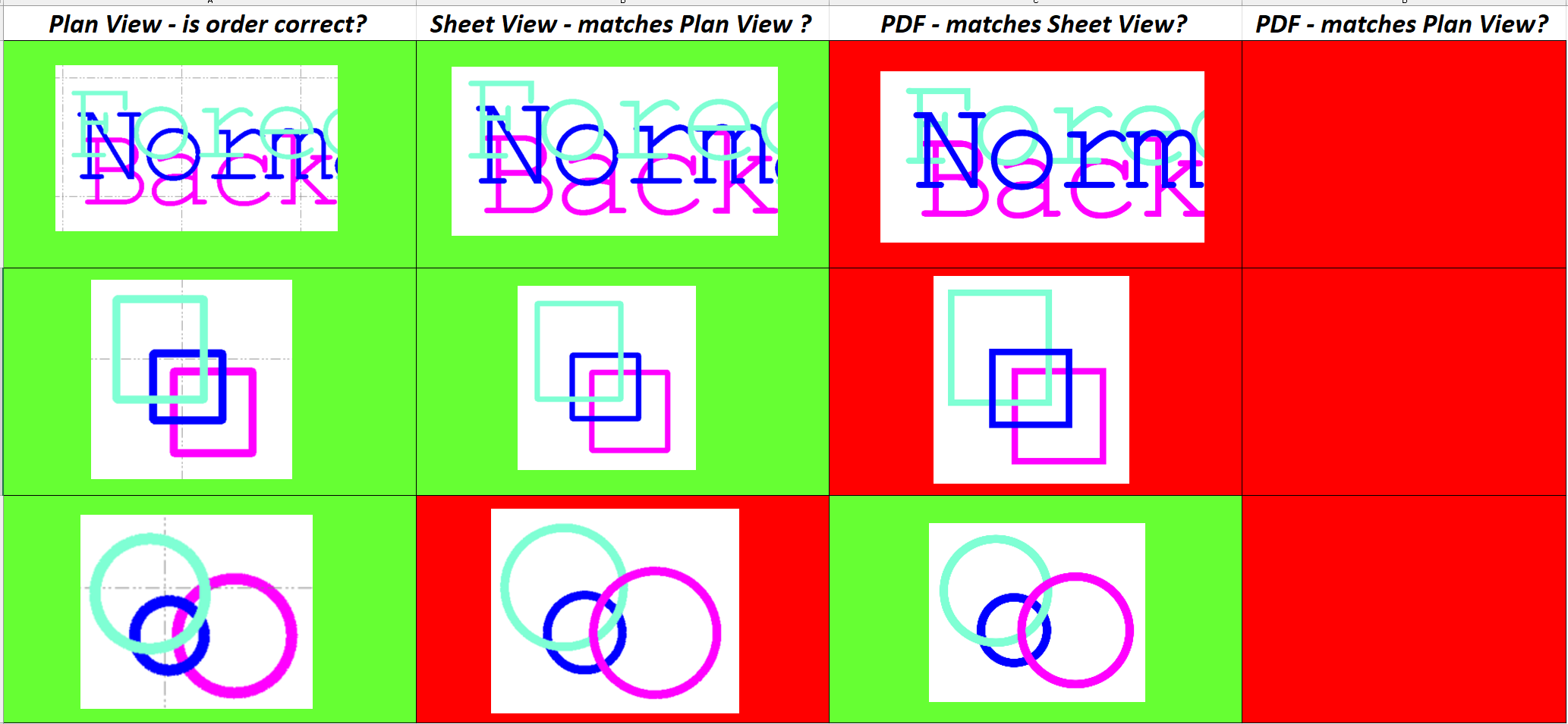
BTW, the view priority in 5.81 is still different between Plan View, Sheet View and PDF for different drawing entities.
Scott Lehr's profile image
Scott Lehr
Thanks Ronny,

I appreciate your time here. You might be right about the PDF reader having something to do with the chunkiness of the text when zoomed out. I usually use Bluebeam for my editing, But I downloaded adobe reader and did some testing. Below is the same PDF file loaded at approximately the same zoom level.  You can see adobe handles the text the best. especially the Text I have for points in the map view. 
There still is a bit of an issue in my mind as I cannot control what PDF reader a client uses to view our drawings. 

You also bring up a good point about the Text being a series of lines rather than a searchable font.  Seems like an an obvious improvement. 

Thanks for you help here, If anyone else has any suggested solutions please let me know. 

SL

Ronny Schneider's profile image
Ronny Schneider
Your last screen shot isn't particular highres, but I can see that in Bluebeam, Chrome and Edge everything is thicker. The colored linework (probably some services) is much more prominent, has more contrast, in those than it is in the Adobe Reader.